Opal · UX Design · Focus App
Designing better focus habits for college students who are tired of fighting their phones.
Role
UX Designer
Team
Brayden, Chris DeMassa, Bess Overton
Duration
10 Weeks
Type
UX Design
The Challenge
Focus apps exist. Students still can't focus.
College students spend hours every day fighting distractions, yet most focus apps either feel overly restrictive or fail to build lasting habits. Tools like Forest, Finch, and Focus Friend each address parts of the problem. None successfully combine productivity, motivation, and healthy breaks into a single experience.
Our challenge was to redesign the focus experience for students who struggle with procrastination, phone distractions, and maintaining consistent study habits.
My Role
I contributed to research synthesis, interaction design, and usability testing across the full 10-week project alongside Chris and Bess.
Research
30 students. One consistent pattern.
We surveyed 30 college students to understand how they currently manage focus and productivity. Students were not asking for stricter restrictions. They wanted better motivation, stronger phone blocking, integrated planning tools, and positive reinforcement.
64%
of students spend 10 or more hours per week on coursework
27/30
students in our survey struggle with procrastination
21/30
students distracted by social media and their phones
61%
had never used a focus app before
Competitive Analysis
Strong apps. Incomplete solutions.
We evaluated three popular focus products and found a consistent gap between productivity tools and wellness tools. None bridged both sides.
Forest
Strength
Strong distraction blocking through gamification
Gap
Limited planning and habit-building support
Finch
Strength
Excellent emotional support and self-care features
Gap
Less focused on productivity outcomes
Focus Friend
Strength
Accountability and companionship features
Gap
Lacks meaningful focus controls and analytics
The opportunity was clear: students needed a solution that could help them focus without feeling punitive. Productivity and wellbeing had to live in the same place.
User Archetypes
Two students. The same underlying need.
Research surfaced two distinct archetypes that shaped our design direction. Both struggled to focus but for different reasons and with different triggers.
Kate — The Scroller
A constantly connected student who fills every spare moment with screen time.
Goals
Reduce mindless scrolling
Build healthier habits
Make downtime feel restorative
Pain Points
Boredom feels uncomfortable
Difficulty disconnecting
Social media consumes free time
Jack — The Drifter
A student who struggles to maintain momentum and often loses track of priorities.
Goals
Stay organized
Maintain focus
Create better routines
Pain Points
Procrastination
Lack of structure
Difficulty transitioning between tasks
Design Direction
Three opportunities from research.
Help Students Plan Their Time
Students already relied heavily on planners and calendars. We integrated a lightweight planning system directly into the focus experience to reduce context switching.
Reward Focus Behaviors
Students consistently responded positively to gamified motivation. Rather than punishing distraction, we designed around rewarding productive behavior.
Encourage Healthy Breaks
Most focus apps only tell users what not to do. We wanted to help students discover what they could do instead, making breaks feel intentional rather than guilty.
The Solution
Three connected features.
Each feature addresses one of the three design opportunities. Together they form a complete focus experience.
Feature 01
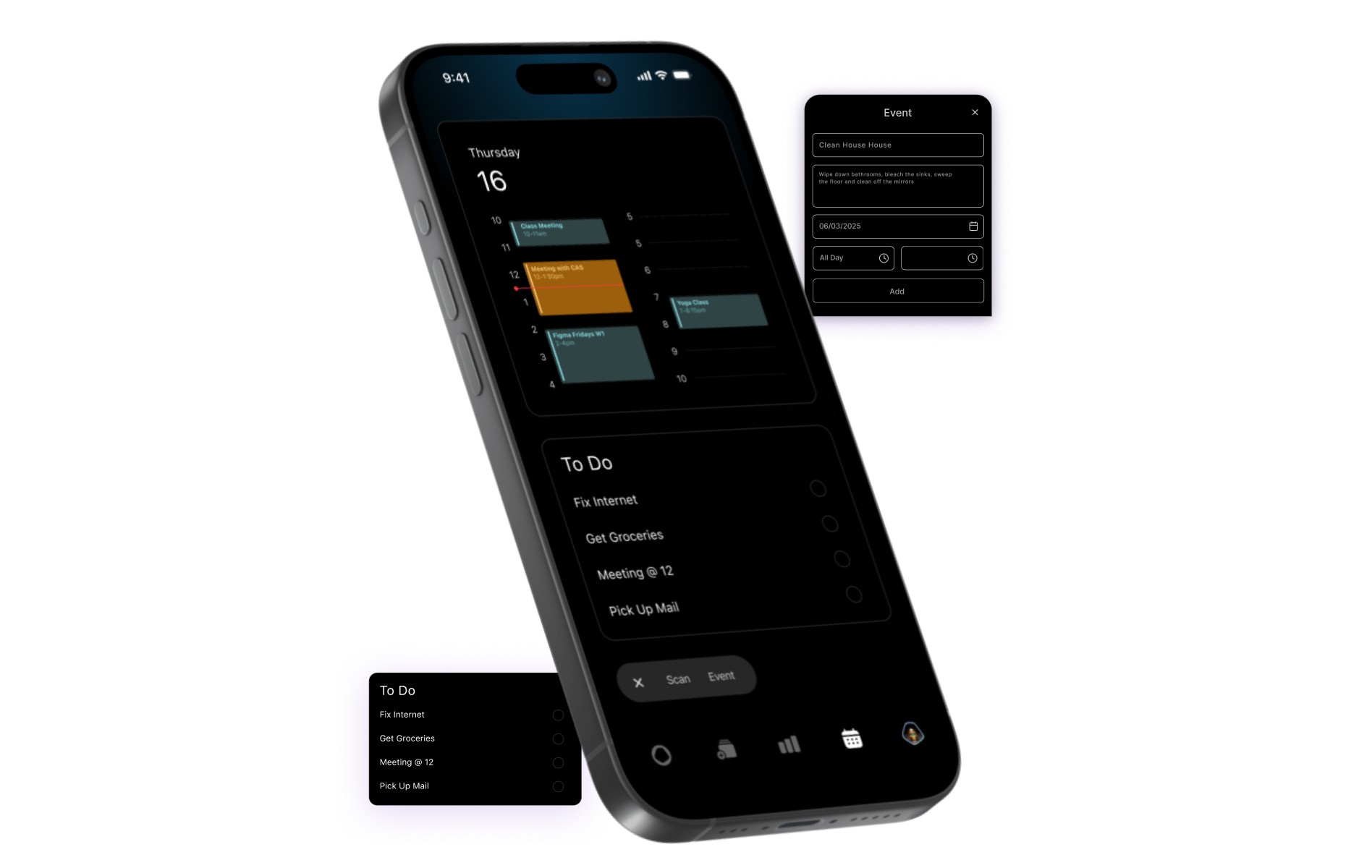
Calendar
A planning system that organizes focus sessions, tasks, and breaks.
Why this matters
Students already use planners to stay organized. Bringing planning into the focus experience reduces context switching and helps users create intentional study routines.
Feature 02
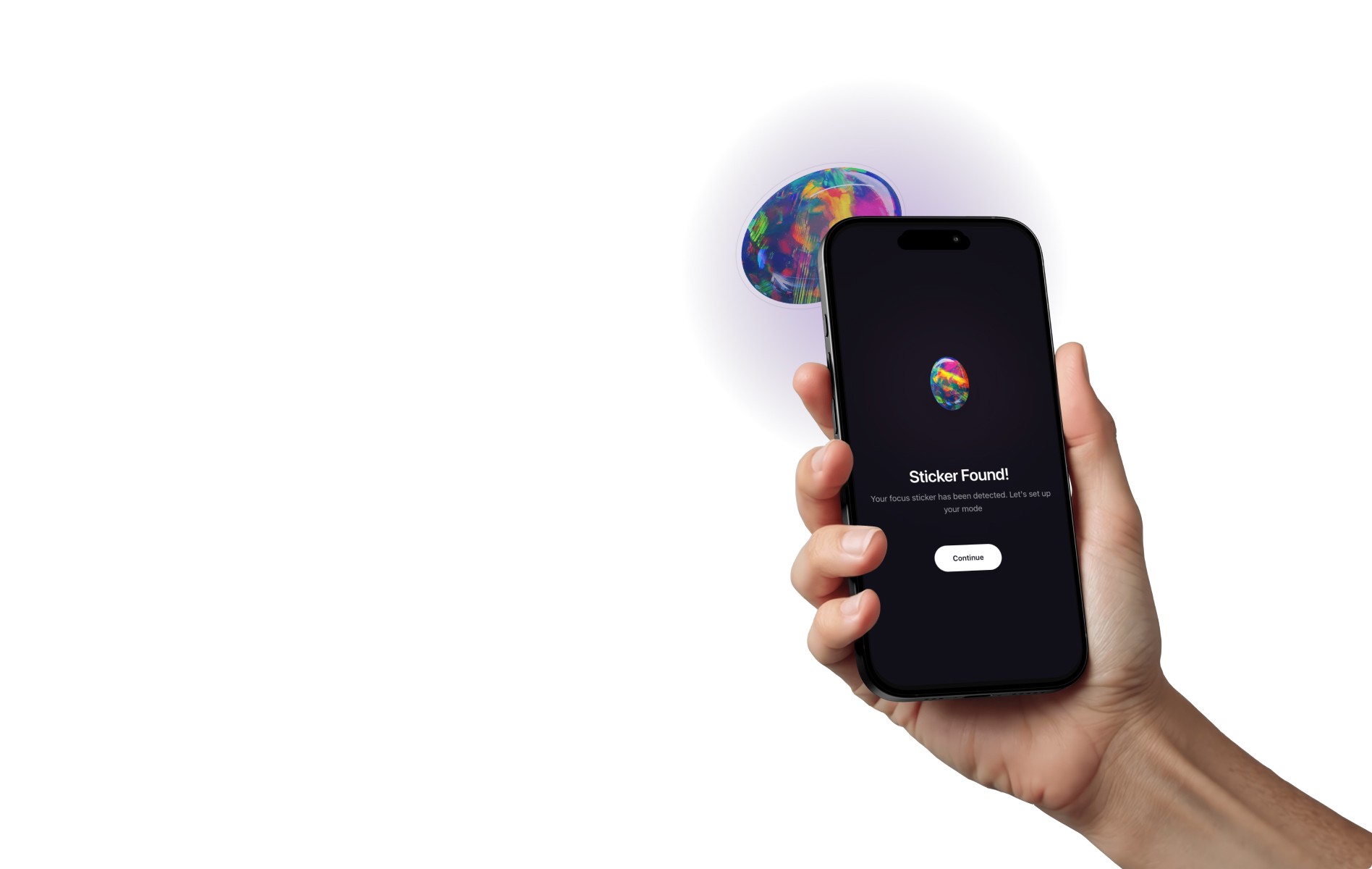
Tap Stickers
A gamified reward system where students collect gems and achievements through consistent focus behavior.
Why this matters
Research showed students wanted motivation, not punishment. The sticker system creates positive reinforcement while making progress visible.
Feature 03
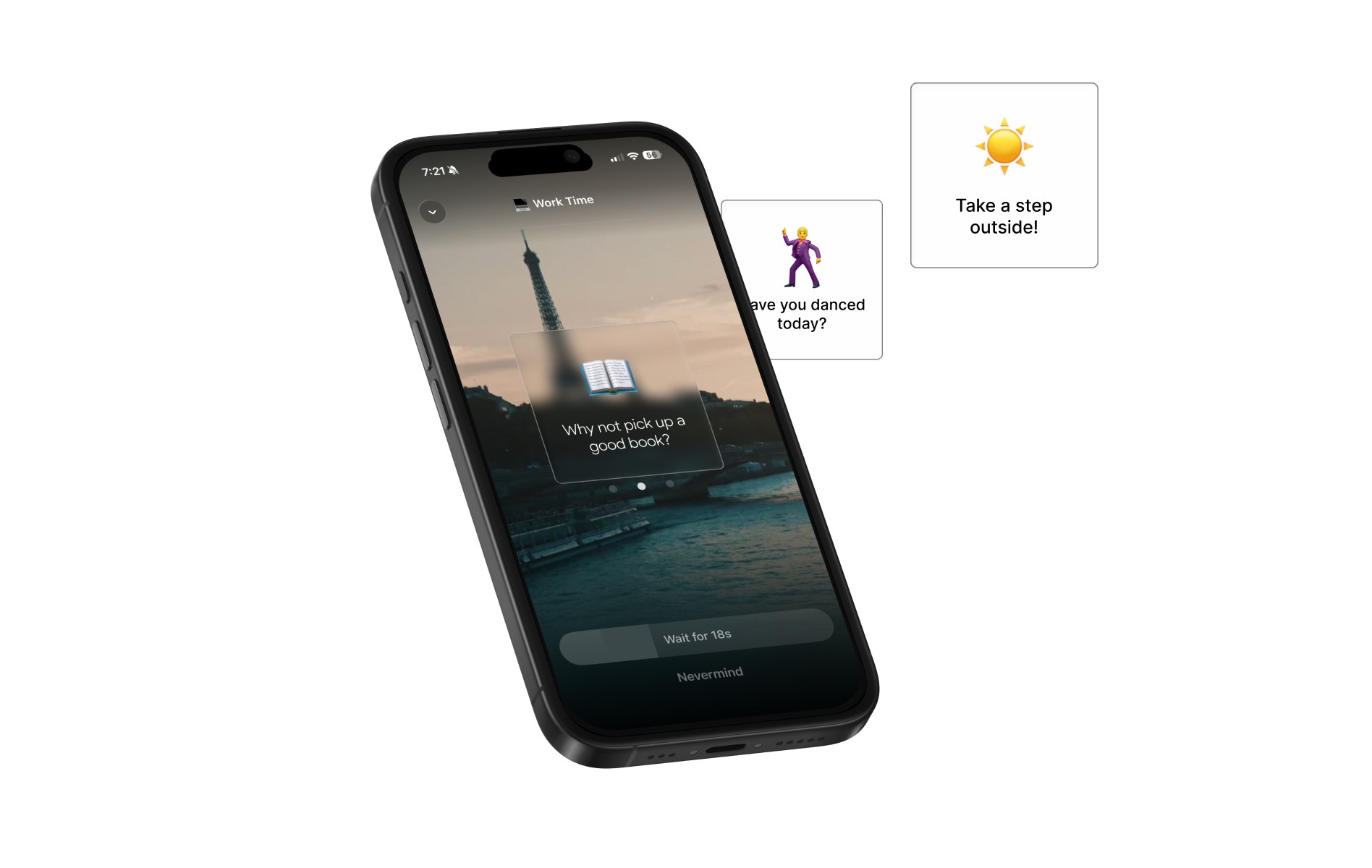
Break Suggestions
A feature that recommends meaningful offline activities during breaks.
Why this matters
Students often replaced one distraction with another. We wanted breaks to feel restorative rather than simply becoming more screen time.
Usability Testing
23 participants. Three clear improvements.
We conducted usability testing with 23 participants across three areas. Each finding led to a specific, actionable design recommendation.
Navigation and Terminology
Participants struggled with the term Event throughout the interface.
Recommendation
Rename to Task or Activity and use more recognizable icons
Scan Feature
Users were unsure how to position the camera while scanning.
Recommendation
Add visual alignment guides and onboarding instructions
New User Experience
Some participants needed additional support understanding advanced features.
Recommendation
Introduce quick tutorials and contextual tips
Design Principles
Grounded in cognitive psychology.
Throughout the redesign, we applied three cognitive psychology principles to make focus feel achievable rather than effortful.
Flow State
People focus best when goals feel challenging but achievable.
Design Response
Progressive milestones, continuous feedback, and reduced distractions keep users in the zone without overwhelm.
Learning Through Examples
People learn more effectively when shown rather than told.
Design Response
Visual examples, activity recommendations, and demonstration-based onboarding replace instruction-heavy tutorials.
Memory and Cognitive Load
Information is easier to remember when mental effort is reduced.
Design Response
Clear language, familiar icons, and simplified workflows lower the barrier to building a new habit.
Reflection
The hardest part isn't helping people focus.
During the project, we tracked our own screen time habits and realized how deeply integrated technology is in daily life. The hardest part is not helping people focus. It is helping them step away from their phones.
This project taught us that successful habit-building products do not just block distractions. They help people create a life worth focusing on.
Structured focus planning
Positive habit reinforcement
Meaningful break suggestions
Reduced reliance on willpower alone
Better balance between productivity and wellbeing
More work
Opal
Focus habits for college students
You are here
Let's work together